![]()
Keynote 8 for Mac hasn’t reached the apex of its perfection, but Apple clearly didn’t have a wishlist of features to push it forward. The latest release for Mac brings it up to date with simultaneous releases of Keynote for iOS and Pages (Mac and iOS) and Numbers [Mac and iOS].
Keynote 8: Getting up to speed
We haven’t reviewed Keynote since version 6.5.3 in 2015, so it’s worth a look of what’s changed since then. Apple continued to push forward development through incremental releases from 7.0 to 7.3, which restored a number of features that we found lacking in 6.5.3.
Version 7.0 added a beta of collaborative real-time editing. Version 7.1 offered up one of the most significant changes: an Object List that made creating complicated builds vastly easier, as selecting and ordering items in the build was a frustrating process that lead to literal head-to-desk slamming. It’s still weaker than other presentation apps, and I’ve spent hours moving items around to create the right flow—but at least now, it’s feasible. In version 7.2, navigation and marking up a document in text (with replies and threaded comments) became far better.
Keynote 8: New features
In Keynote 8, Apple added a small list of features that make it easier to move presentations between iOS and macOS. Also, there’s more consistency with tools and expectations across Keynote, Pages, and Numbers on both platforms. That should reduce any friction as you work among apps and across platforms, even if nothing else has changed.
Image galleries are the only new interactive feature, letting you insert and label images in a frame that can be paged through manually or as an auto-advance slideshow. You can preview this while setting it up, and then advance through the images while presenting or set it to run. Creating a pseudo-slideshow through builds in version 7.3 was maddening; now, it’s just a drag and drop process. For automatic or manual playback, you can set one of three kinds of builds through the images: Appear, Dissolve, and Move In. For automatic playback, you can set the duration between images. This is a very welcome addition.

IDG
Media selection remains extremely laggy, even on a 2017 iMac. While I have an iCloud Photo Library of over 37,000 images, they’re stored at full resolution on this iMac, and it took minutes to bring up the initial selection view. If you switch away from Keynote, at least the load progress is not lost (as it is in Pages 7 for Mac). The media selector is a system-wide function, but it’s readily apparent how poorly optimized it is in a program designed to use images.
Keynote now offers donut charts, a missing option despite the many other kinds of charts available in this and other Apple productivity apps. As with all the updates to apps, there are new shapes of all sorts you can insert and then edit to customize. Support for real-time collaborative editing for Keynote files shared via the Box document service is now included here as in all the productivity apps on both platforms.
 IDG
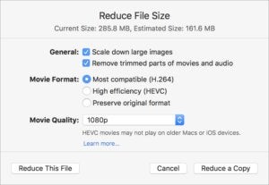
IDGApple also added a way to reduce the file size of presentations, something useful when you’re dragging in full-resolution images or movies that you’re using just a portion of. With File > Reduce File Size, you can opt to downsample, using Apple’s versions of more efficient HEIF image and HEVC video compression, and clip video and audio to store just the portions used in the file. Be wary, though, that you don’t create a presentation that needs to run on an older Mac that can’t display these file formats.
Bottom line
Keynote 8 for macOS is not much more than a maintenance release, despite inserting the suite-wide image gallery feature as a slideshow option. Even though it’s a mature app that’s generally good to use, Apple should be considering a roadmap for improvement of its weakest elements, and pushing forward with new modes and better processes for building and revising interactions.


